Overview
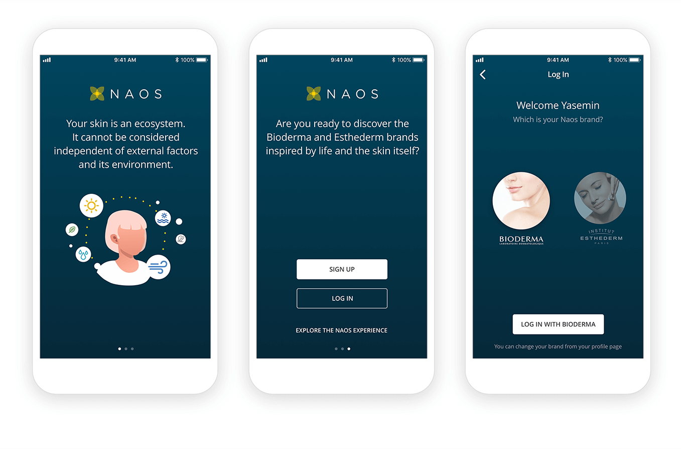
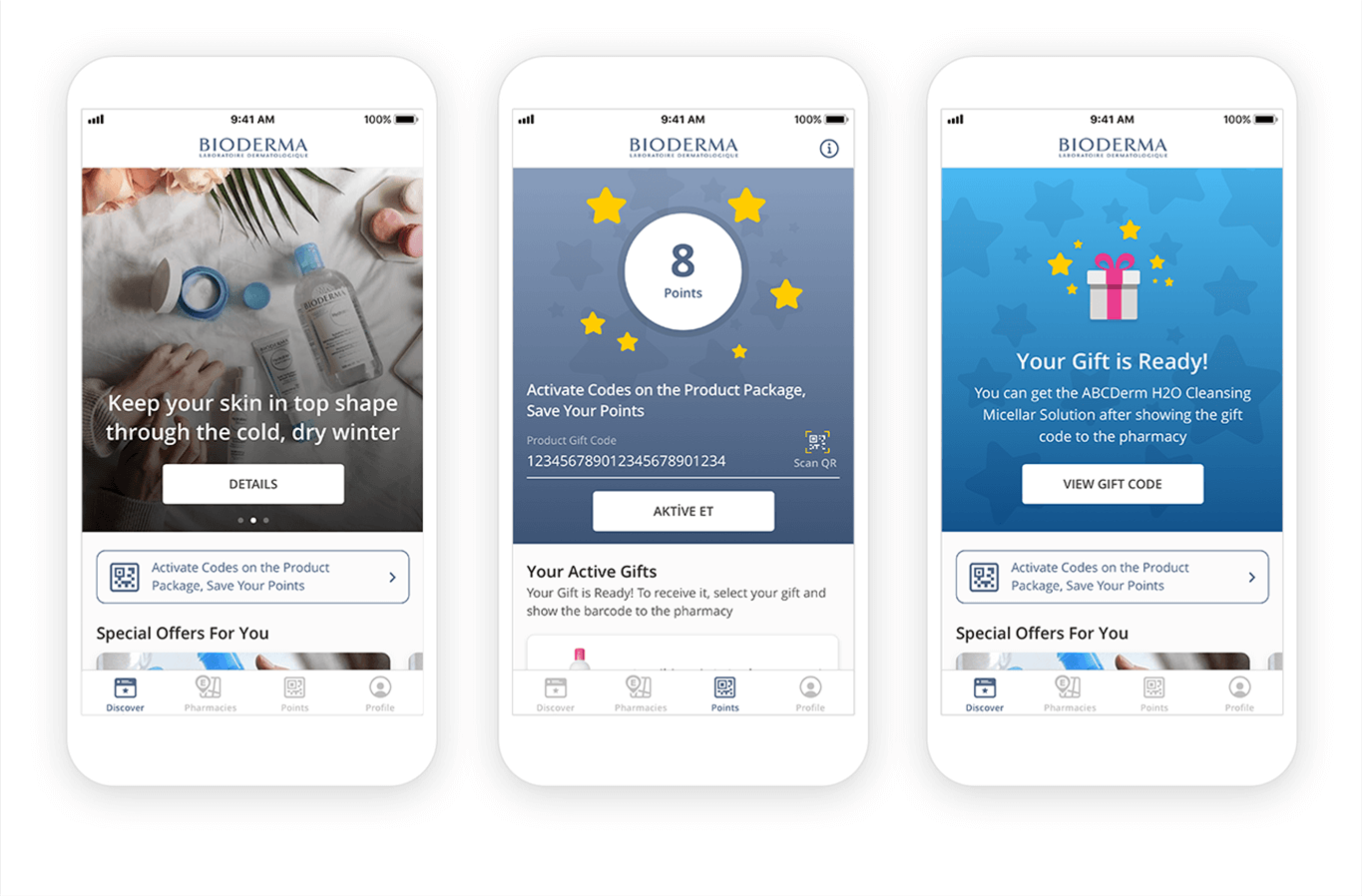
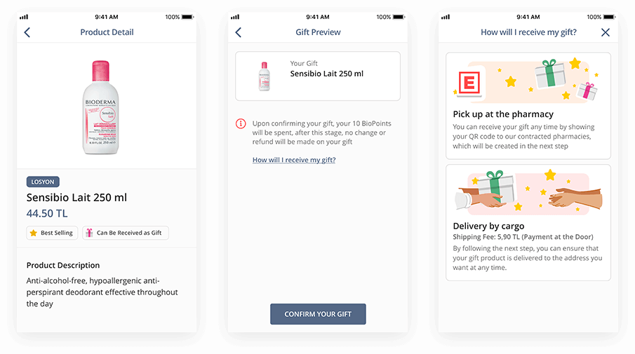
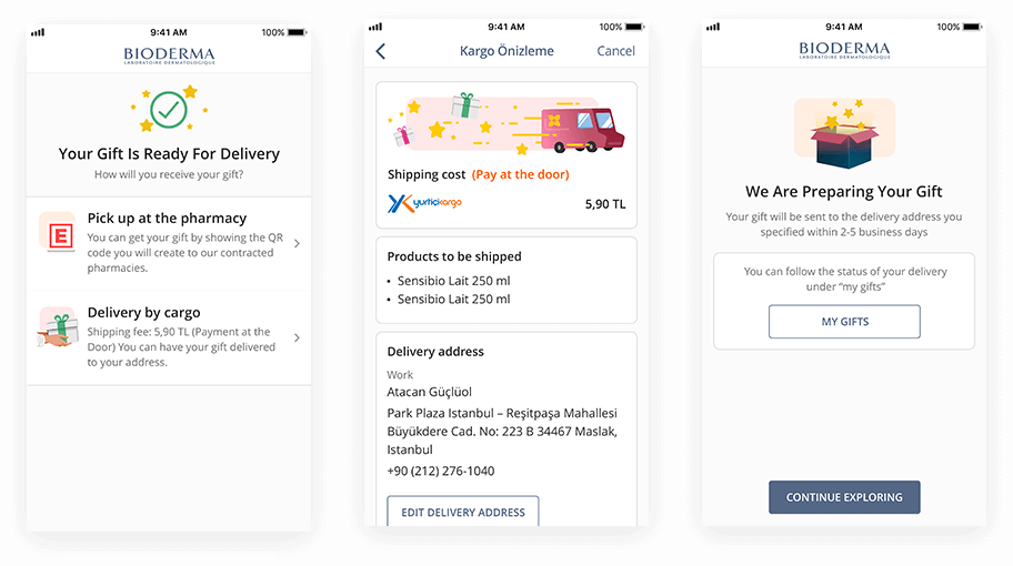
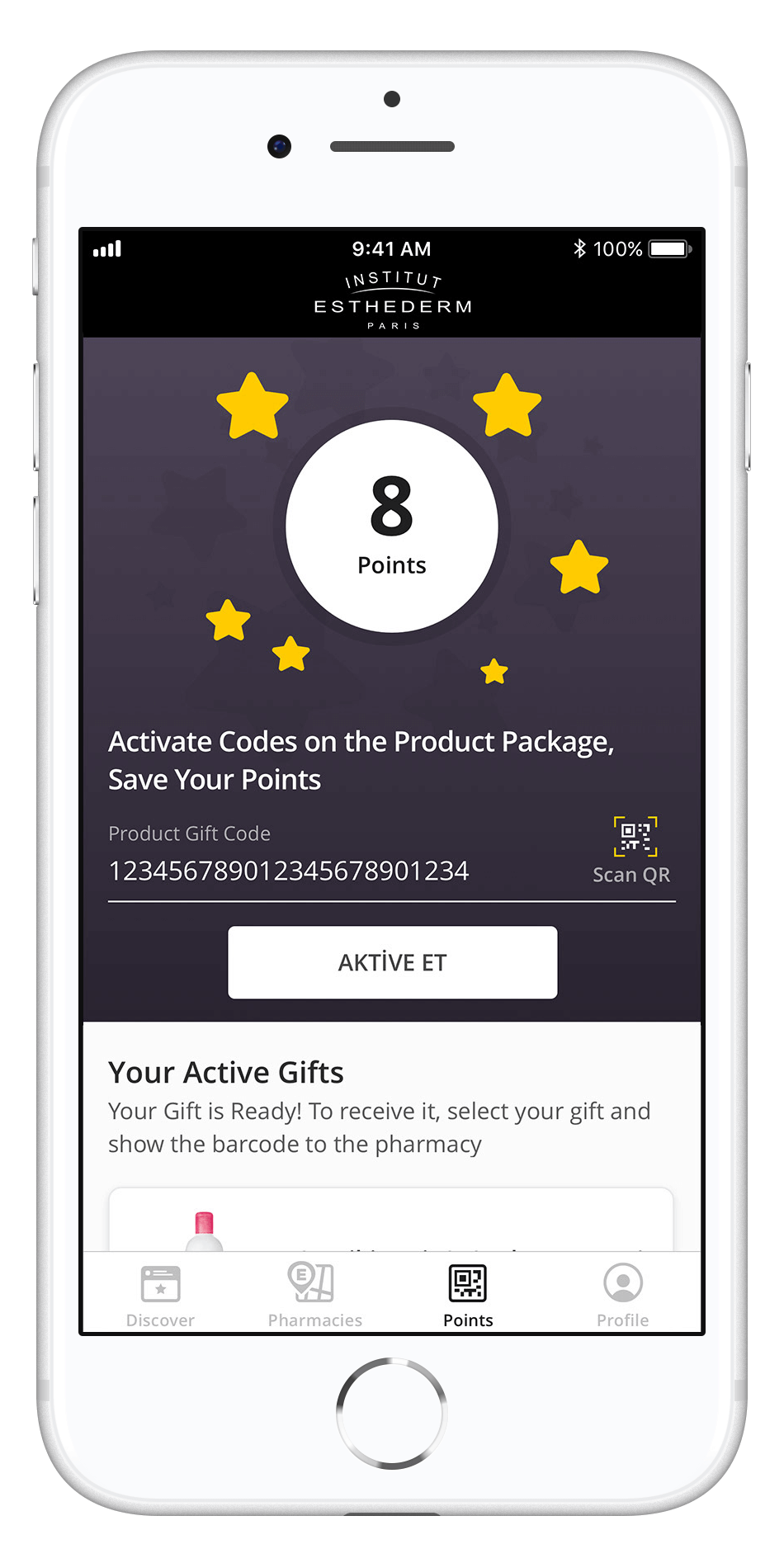
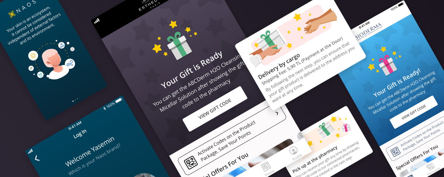
Naos is the main company that makes skin care products in the beauty industry. The businesses' main brands are Bioderma and Esthederm which are mainly aimed at different age groups and solve different skincare needs. These products are only sold in pharmacies and had a loyalty service that needed to be integrated.
My Role
I was the UI designer on an Agile team with a UX Designer, 2 developers, a business analyst, a project manager, and a QA Engineer. I was responsible for determining the overall design direction of the project while collaborating with the rest of the team on ideation.
Client
Naos
Year
2019
Deliverables
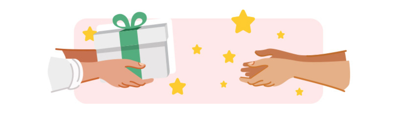
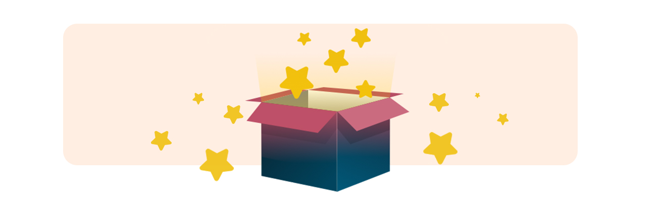
User Experience
User Interface
Illustration
Animation
User Interface
Illustration
Animation